Rebrand for a menswear company on a mission to end fast fashion, building an emotional connection between its long-lasting garments and the people who wear them.
Rampley & Co launched in 2017 as a menswear brand built around silk prints and pocket squares. By working with fine art collections from Tate Britain and the V&A, they carved out a niche of their own, pairing printed art with British manufacturing to make distinctive pieces that last and carry a story.
As business formal dress became rarer, customer appetite for ornamental pocket squares was shifting quickly towards a gifting market. Rampley & Co responded by planning to widen their range into more casual categories such as knitwear and jackets. They approached us to guide the brand through that change. The task we took on was to redefine Rampley & Co for its new casual offering while keeping faith with its fine art beginnings. We needed to carry the brand beyond fine art prints and find a design direction that would reposition it as a contemporary British label, one capable of giving its audience a richer artistic experience.

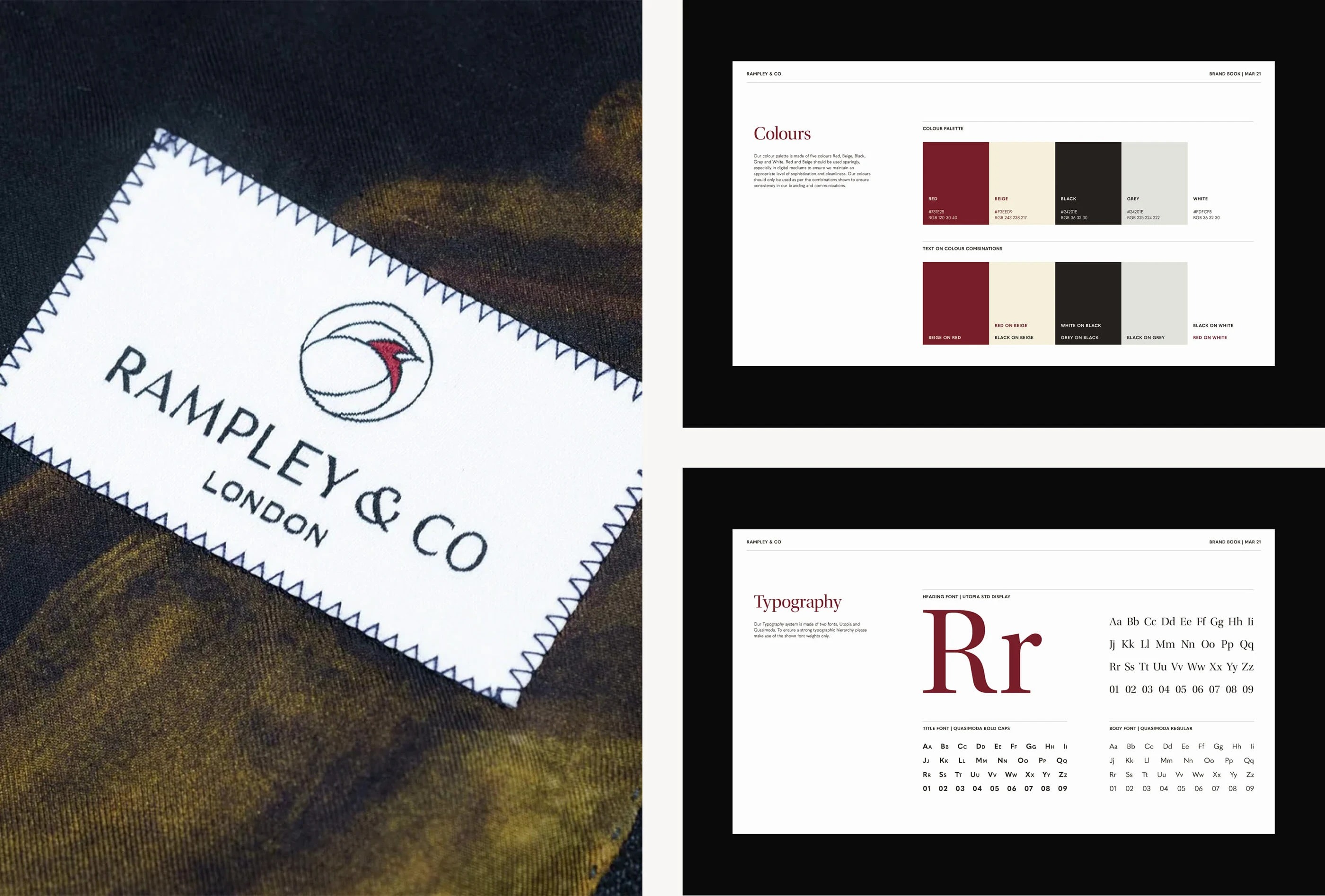
The robin had always been part of Rampley & Co's branding. As Britain's national bird, it offers a quiet but meaningful nod to high-quality British manufacturing. Keeping that reference at the heart of the new identity mattered to us, though not at the cost of a sophisticated, contemporary feel. To hold both, we reimagined the robin as a simple geometric profile with a fluid line. We cropped into the bust of the bird to draw the eye, creating a confident logomark that recalls the tradition of silhouetted portraiture in a refined, modern way.

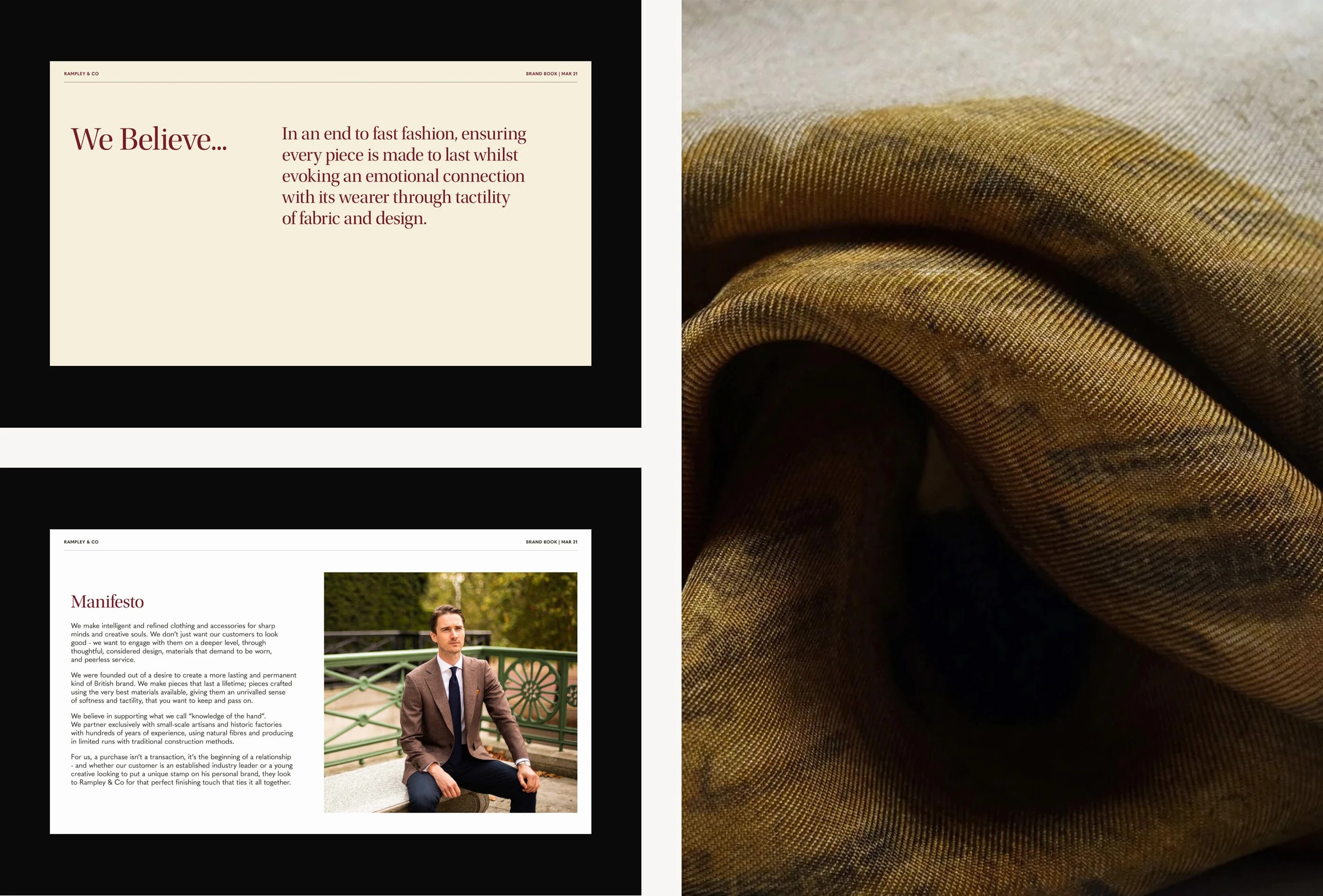


For the brand to give its audience more, it had to speak with confidence about the craft behind the work while still feeling artistic and tactile, true to the materials and textures of the products themselves. That thinking grew out of the company's own belief: an end to fast fashion, every piece made to last, and an emotional connection with its wearer through the tactility of fabric and design.
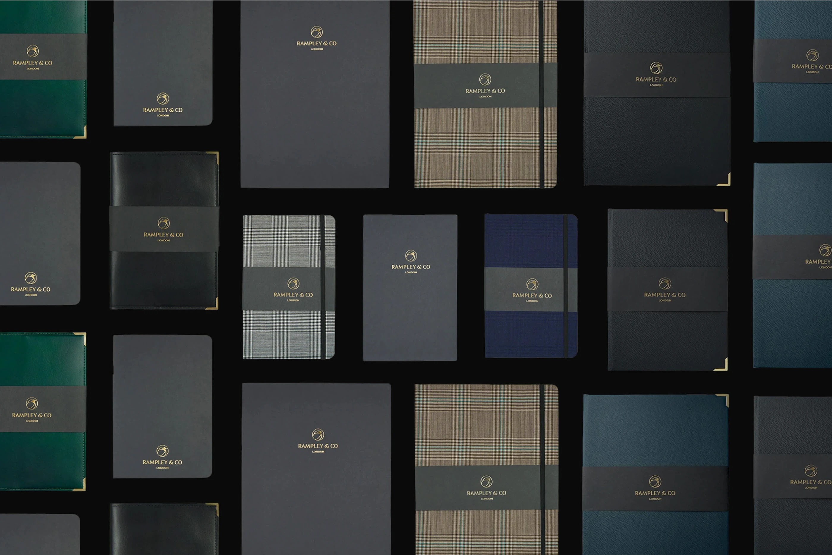
We paired the reinvented logomark with a rich, autumnal palette that reflects the natural character of the brand. The typography brings together Utopia Std, a serif, with Quasimoda, a sans-serif, for a system that reads as traditional, legible and quietly sophisticated. Set side by side, these elements give Rampley & Co a contemporary and timeless identity that holds up across textile, packaging and digital.